The text only web
Yesterday, Tim Lockridge noticed that NPR published a text-only version of their site to help people dealing with connectivity issues in storm-affected areas get access to news and critical information.
NPR has a text-only website for storm-affected people with limited connectivity. It’s a great idea: https://text.npr.org
But it also makes me nostalgic for a simpler, less ad-infected web.
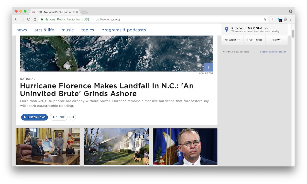
Here’s the regular NPR site today.

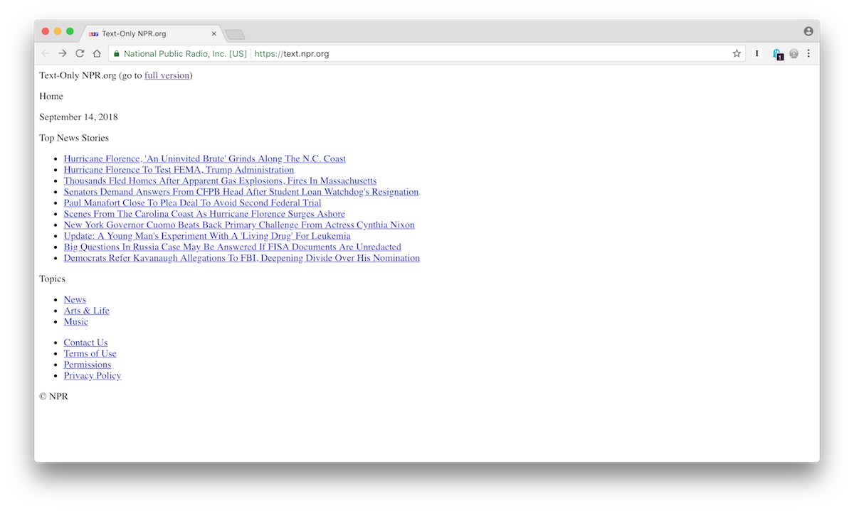
And here’s the text-only version.

My gut reaction is that the text-only version is both way uglier and way, way more functional.
I can see everything in a single view. There’s no distraction. It’s just the news, without the bullshit.
And it’s so much faster!
You could make this prettier (maybe add a logo, restrict the overall width of the page a bit) and change nothing else and this could be a beautiful, awesome site.
As a I mentioned yesterday, we’re ruining the web with all the junk we don’t actually need. I want all news sites to look and work like this.