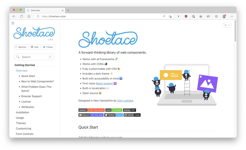
Shoelace

Shoelace is a UI library (a bit like Bootstrap) built with native Web Components and vanilla JS.
For example, let’s say you wanted to add a spinner to your web app while content is loading. With a traditional UI library, you might do something like this…
.spinner {
	flex: 1 1 auto;
	height: 100%;
	width: 100%;
}

.spinner__track {
	stroke: var(--track-color);
	transform-origin: 0% 0%;
}

.spinner__indicator {
	stroke: var(--indicator-color);
	stroke-linecap: round;
	stroke-dasharray: 150%, 75%;
	animation: spin var(--speed) linear infinite;
}

.spinner__track,
.spinner__indicator {
	fill: none;
	stroke-width: var(--track-width);
	r: calc(0.5em - var(--track-width) / 2);
	cx: 0.5em;
	cy: 0.5em;
	transform-origin: 50% 50%;
}<svg part="base" class="spinner" role="progressbar" aria-valuetext="Loading">
<circle class="spinner__track"></circle>
<circle class="spinner__indicator"></circle>
</svg>With Shoelace, you do this…
<sl-spinner></sl-spinner>Because it’s a Web Component, all of the required CSS and JavaScript is automatically loaded with it, and scoped to the component.
Shoelace provides a bunch of ways to install it, including an autoloader that will only load JS for the Web Components you’re using, as well as the ability to manually import the components you want and run them through a build step.
This is a really cool project! You can read the full docs here.