A case study in alt text
A few weeks ago, I talked about how to write good alt text for images. Today, I wanted to look at a real-life example.
Let’s dig in!
BOO-lean operators!
A few years ago, Twitter user @38mo1 shared a funny graphic showing different types of boolean operators as jack-o-lanterns.
The original image lacked alt text. Last week, Anastasia “Stacy” Collins kindly reshared the image with alt text added.
What’s good alt text?
In my article on good alt text, I wrote…
When writing alt text, try to describe the details of the image rather than simply stating what it is.
This is, in my experience, the most common things that people get wrong when writing alt text.
Stacy’s alt text read…
Six panels that visualize boolean operators / machine logic using Venn diagrams decorated to look like Jack-o-Lanterns
This is a nice description of the image. However, it still excludes visually impaired users from consuming and participating in the content of the image itself.
It would make a description or figcaption.
I want to be very clear that I’m not picking on Stacy here. This is how I used to write alt text, and you can almost certainly find lots of examples like it on my website.
Writing alt text like this comes from a good place! It means people are aware that its important, and are trying to do the right thing.
Creating better alt text for the BOO-lean image
For the BOO-lean image, better alt text would describe the contents of each panel.
This allows visually impaired users who navigate with a screen reader to get the same information that a sighted user would be able to just form looking at it.
I’m sure this isn’t perfect, but here’s my attempt at it…
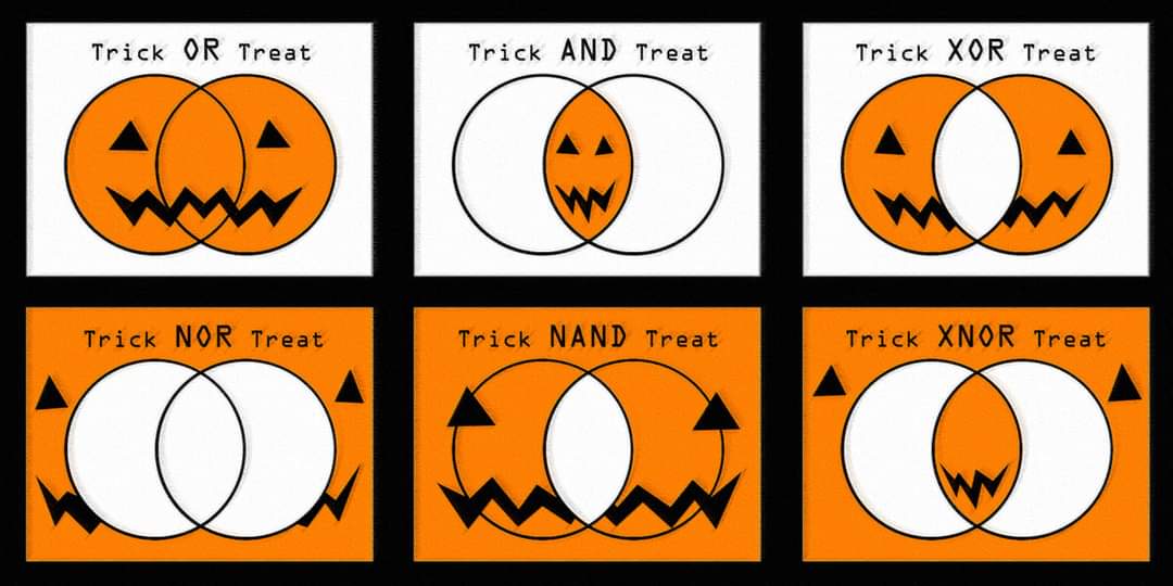
A graphic with six panels. Each one contains a boolean operator illustrated as venn diagram jack-o-lanterns.
Trick OR Treat: both circles are orange, and have one of the eyes, while the smile runs from one circle to the other.
Trick AND Treat: the overlapping area is orange, with both eyes and the smile inside it.
Trick XOR Treat: both circles are orange and have one of the eyes, but the overlapping area is white.
Trick NOR Treat: The background is orange, with eyes and a smile, while both circles are white and blank.
Trick NAND Treat: both circles and the background are orange, and contain the eyes and smile, while the overlapping area is white and blank.
Trick XNOR Treat: both circle are white, both the background and overlapping area are orange, the eyes are in the background, and the smile is in the overlapping section.
If you’re looking at that and thinking, “wow, that’s a lot of words!” you’re right! It is!
When we create and share images without alt text, we’re robbing people who rely on screen readers of so much information and content. That’s why it’s so important to to write good, detailed alt text for your images.